Wednesday, March 25, 2015
This is an absolutely amazing photo I saw while looking at "Star Trail" photos on Flickr. I love how the slow shutter speed blurred the lights of the cars and the stars to create the streaking effect seen here. The vibrance of the light creates a lot of contrast against the dark night sky, adding visual interest. The photo has a great illusion of depth with both of the beams of light diverging at a vanishing point in the horizon. Hope you guys enjoy it too!
More of the photographer's work, Matt Molloy, if you want to check it out: https://www.flickr.com/photos/matt_molloy/
Sunday, March 22, 2015
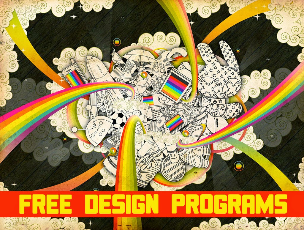
Wanted to show you guys something different and cool! I love this because the text in the bottom has excellent emphasis with leading lines drawing the eye into the graphic in the center. A lot of it looks like hand drawn art scanned in which has a very cool sharp look to it. It's very vibrant and it has a lot of movement to it, creating a happy cheery mood for the viewer. Just looking at this makes me feel excited!
Wednesday, March 18, 2015
Hey guys, I hope you all had a fabulous day! I was looking at surreal photography and this one caught my eye! I love the angle at which this photo was caught, almost seeming as though she is hanging off the world. It's very bizarre and whimsical; what's not to love about it? There's emphasis on the subject and there's leading lines directing your eye to her. The subject is in clear focus and overall, great shot!
As always, here is the link: http://balisticterrorbunny.deviantart.com/art/Dreams-edge-180917027
Monday, March 16, 2015
Monday's can be rough so here is an inspiring photo, taken by Michael Reed, to help you guys through the week. I love the depth he creates with this photo with the subject in emphasis in the foreground. The high contrast black and white sepia effect helps connect the photo connect to a larger idea; in this case it's memories. I hope his defiant gaze into the wide expanse of the ocean will help all of you make it through the week!
To check out more of his work: http://www.thedphoto.com/inspiration-fix/inspiring-photography-of-michael-reed/
Thursday, March 12, 2015
It's almost Friday guys and I wanted to show off a logo for a fictional company I created a while back. I absolutely love drinking tea and with that I gained my inspiration! When one thinks of tea, it's origin, china, naturally comes to mind! On both sides I wrote "Tea" in traditional Chinese to reflect this origin and to create a sense of balance. I picked the color scheme of green and red because they are complimentary colors, creating contrast.
Wednesday, March 11, 2015
It's hump day again today to all you who aren't frustrated when they see the term "hump day"! Went out today to take a photo-shoot and I managed to snap this HDR picture which a edited in Photoshop later to create this eerie effect. What completes this photo for me is the high contrast appearance it has, emphasizing the subject, the old building, and furthering it's creepy appeal. Let me know what you guys think; any constructive criticism will be appreciated!
Thursday, March 5, 2015
Tuesday, March 3, 2015
I was quickly glancing at the photos from USA Today and I found this beautiful picture of the Hagia Sophia in Istanbul at night. The picture is beautiful, especially with the building illuminated, and textured with the raindrops. What's very neat about this is how the camera would've had to be a slower shutter speed to blur the raindrops but the person at the bottom is in focus, requiring a faster shutter speed! My guess is two photos were taken and they were combined together. Lemme know what you guys think this person did.
Subscribe to:
Comments (Atom)


